


Table of contents
Hey Devs, it is that time again, There is a new version of Flutter and you are probably one of those wondering what new cool features have been added to the framework, I am here to give you the gist of what this new version is about.
FRAMEWORK UPDATE
The improvement for this version was channeled into
Platform Adaptability
Enhanced Customization
New Capabilities
Optical Character Recognition (OCR) in IOS Textfield
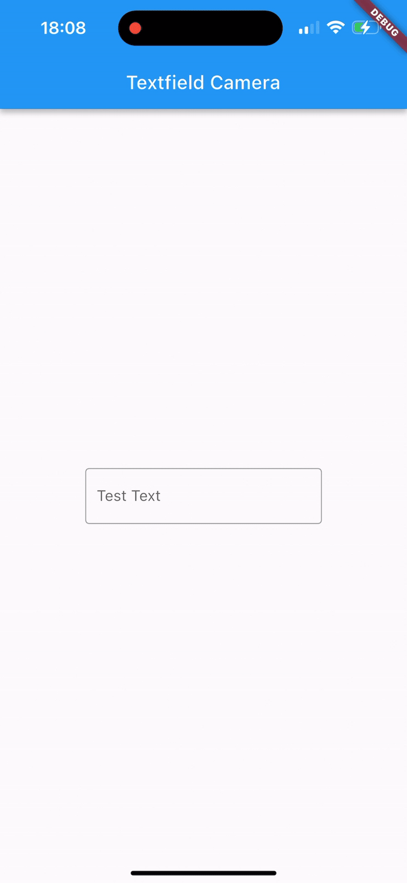
Ios Flutter apps now have the capability of scanning words from the camera and inputting them into the text field, This is such a cool Machine Learning feature. Most new Flutter devs would not know how cool this is but OG's like us know how we had to suffer to configure Firebase machine learning just to get a taste of this feature. We obviously cannot thank
luckysmg and tgucio enough who wrote 1000 line code with 70 commit to make this possible
Adaptive Constructor
The AlertDialog now has an adaptive constructor function that will display the right AlertDialog depending on the phone OS, what this means is that when you add the showAdaptiveDialog function, it will either display a material dialog if the device is an Android device and a Cupertino alert dialog if the device is an IOS device.
if(current.platform == android){
Alertdialog
}
else if(current.platform == IOS){
CupertinoAlertDialog
}
Here is how it will look like for IOS utilizing the Cupertino
and this is the Alert Dialog for Android that is based on Material
Cupertino DatePicker with month and year
With Flutter 3.13 you no have access to monthYear mode to the CupertinoDatePicker
This feature follows the current design trend and we love that the Flutter team works hard to make sure all these new trend and features are accessible at our fingertips 👏
Cupertino Check Styled Radio
CupertinoRadio now has a property called useCheckmarkStyle that allows the Radio. adaptive and RadioListTile.adaptive to show if they use the checkmark style on IOS
TextField Error Customization
The Flutter 3.13 now comes with the error property for InputDecoration in the place of string which would give you more leverage to customize the widget like the one below that uses a combination of icons and text like the one in the image below
Addition of tooltips to ButtonSegment
when a user hovers their mouse pointer over these buttons within the ButtonSegment, a small piece of text or information will pop up. This text will provide a brief description of what that button does or what action it performs. This helps users understand the purpose and function of each button without needing to click on them to find out.
Overall, the addition of tooltips to ButtonSegment is a design improvement that enhances the usability of Flutter apps by providing clear and helpful information to users, making it easier for them to navigate and use the application effectively.
materialGapSize Property
You can control the amount of space between the different expandable panels within the ExpansionPanelList using the "materialGapSize" property.
This is valuable for design customization because it lets you adjust the visual spacing between the panels to match your preferred look and feel or to optimize the layout for your application's design. It gives you more control over how the panels are spaced apart, making your interface more visually appealing and user-friendly.
trackOutlineWidth Property
This is a property that affects the width of the outline (border) of the track portion of the Switch. The "track" here refers to the background area of the Switch that represents its state. this customization feature lets you fine-tune the visual presentation of the Switch widget in your Flutter app by adjusting the width of the outline around its track portion.
Tilepadding
you now have the ability to control the amount of space around each item (tile) inside the Navigation Drawer in your Flutter app. By using the "tilePadding" property, you can fine-tune the spacing to match your app's design aesthetics and provide a better user experience.
This customization option gives you more control over the layout and appearance of the Navigation Drawer, ensuring that the spacing around each navigation item is visually appealing and aligns well with the overall design of your Flutter app.
MateriaState Color Property
you have the ability to define specific colors for chips when they are in different states (like normal, focused, pressed, etc.) in your Flutter app. This enables you to create a more consistent and visually appealing design by ensuring that chips look appropriate and visually pleasing in different interaction scenarios.
This customization option gives you finer control over how chips appear in your app's user interface, helping you maintain a consistent and polished look across different states of interaction.
Elevated Chips Coming Your Way
These new chip variations could have updated styling, animations, or behaviors that align with the latest Material Design principles.
In practical terms, this means that developers using Flutter can now utilize these new elevated chip variants to create user interfaces that follow the most up-to-date design standards set by Material Design. This helps ensure a modern and cohesive look for apps built using Flutter's UI components.
A big thank you to kelvin chisom for explaining all these and providing the visual images to help devs understand better.